

Trend Defined and Illustrated
Posted by Dennis in Currency Trading, Guerrilla Trading, Instruction
Trend Trading the Guerrilla Way
What Is A Trend?
The first and most fundamental question that a trader must answer before entering any trade is: What is the trend?
Defining trend is a task that is deceptively simple. Trend is the dominant price direction over a previous length of time. While this definition is complete and accurate, it raises more questions: What is "dominant" price direction and how dominant does it have to be? How long must the "previous length of time" have to be?
Put very plainly, trend is established over a period of at least 200 time frames of the time frame you are charting or using. Hence if you are looking at a daily chart, then trend is defined over the previous 200 days or more. If you are trading based on a 15 minute chart, then you look at 50 hrs or slightly more than 4 days.
Trends can be Complicated
A more reliable view of trend will be obtained by looking at higher time frames. You should know what the trend is for the hourly time frame, 4 hour time frame and daily time frames under all circumstances. This knowledge will help decide how you take trades and how you determine profit targets and stop losses.
Complicating the trend picture is knowing whether a trend is near its end and about to reverse. Also vexing is the question as to whether a leveling of the trend (a flattening of the upward or downward slope) is a pause in the movement up(or down) or an indication of an impending reversal. And if that wasn't enough to scare you into inaction, perhaps the last pullback is not a reversal but rather a temporary sell-off (or buy-off) before price again returns upward (or downward).
The Trend Is Your Friend
First rule to remember: a trend always goes longer than you expect. No one has ever made millions by jumping the gun on a trend reversal. But the trading landscape is scattered with the bones of traders killed by prematurely trading a reversal. This point can not be stressed enough. If you trade against the trend, make certain that your stops are tight and the reasons for taking the trade are well defined and confirmed by historical patterns and extensive back-testing.
Most of the books and reference material I have seen classify trends as long-term, intermediate and short term. Because Guerilla trading is fast paced and based on a 15-min time frame I don't look to long-term trends. I look at intermediate and short term trends.
I use a 248 EMA (Exponential Moving Average} to determine intermediate trend and a 62 EMA for short term. For more recent trends such as the past week, day or even the past few hours I will draw an up-sloping trend line along the bottom points or a down-sloping trend line along the top points.
Trends by Sample Charts
Now lets look at some examples of trends in various time frames. Each of these charts can be viewed in detail by clicking on it.

4 Hour Chart 02/23 - 04/17
The chart on the left show trend on a 4 hour chart. The time span is about 230 periods or about 56 days. Trend is clearly upward. Two lines are drawn to indicate the trend.
The straight red line is a trend line drawn along the bottom points. The yellow line is a 248 period EMA. This roughly parallels the red trend line.
The next chart is a daily chart. The time span is the same relative to the 4hr chart of about 230 periods. However, because this is a daily chart the time span covers nearly 8 months.
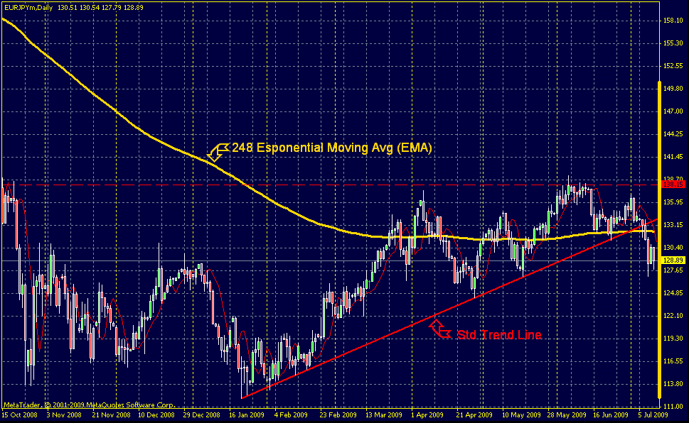
Daily Chart 10/15/08 - 07/10/09
The 248 EMA inicates that the daily trend was very bearish over the six month period Oct 2008 to Mar 2009 but has flattened out the last 3 months. The red trend line shows the recent trend has been upward. Notice how accurately the line connects with the bottom points. Once the trend is broken as is the case where price fell below the red line very recently, one can expect that there will be a big movement counter trend.
The uptrend in the four hour chart is seen in the daily chart. If the daily chart indicates a moveement against the trend, a reversal, then we can anticipate the same in lower time frames.

Hourly Chart (1) 03/11/09 - 03-25-09
Now lets examine the hourly charts. Becuase of the time frame covered by the 4 hour chart, we will look at two different charts ofr an hourly analysis.
The first chart covers the period March 11 to March 25. As we would expect from the 4 hour chart, we see a strong uptrend in the hourly.

Hourly Chart (2) 03/26/09 - 04/09/09

15 Min Chart 04/02/09 - 04/06/09